- 1 of 8
- ››


At first we may want to go with an editor that's simpler than CKeditor although CK has the great advantage of managing links better than pretty much all the other editors out there. (i.e. you can click in the link, then click the link icon and the editor automatically selects the whole link for you. Other editors simply assume that your selection ability is perfect!)
The editor must have at least the following to be considered complete enough:
The following are really nice to have but not required:
The editor is preemptive. This means if you are editing, no one else can open the editor to also edit the same page. You leave for hours and your lock is still in place... what to do?
The auto-save can be used to save a revision that is marked as in need of moderation and thus not published.
See Page feature [core] for details.
See Auto-save feature for the auto-save details.
See Locale feature (Date, Time, numbers, currency, etc.) [core] for a core extension of the editor widgets.
The Silent widget is the same as showing data in the form. It may be more practical to make use of the Silent widget because that way it is part of the form, although it is only sent from the server to the client and never the other way around. It is really just static data to be shown to the client.
A Text Edit widget allows the end user to enter text as in an editor. This allows the user to enter tags of any kind and other things such as scripts and stylesheets, although we do not give direct access to the HTML code yet so those may be difficult at this point.
The editor toolbar generally appears over this widget (it can be turned off) and let users modify their data entry with styles such bold, italic, alignment, etc.
The result of a Text Edit widget is HTML code. You may save it as a string or HTML in the database.
The Line Edit widget allows the end user to enter one line of text. The Enter key is prevented in these widgets. Also, by default these widgets do not accept tags.
Once we implement the password feature in our Line Edit widget, we may want to support the same capability as Internet Explorer offers which is to click on an eye button to temporarily see the password. This could be useful to allow users to see whether they mistyped the password or not.
The result of a Line Edit can be setup to String, HTML, or Plain. In most cases, you most certainly want Plain which will remove any tags and transform HTML entities to plain text (so "<" will appear as "<" as you probably would otherwise expect.)
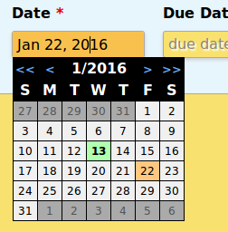
The Line Edit can be made a Date Edit object if you want your users to be able to select the date from a small calendar. This is quite practical for dates around Today or around the date predefined in the field. Other dates can be entered directly in the Line Edit part of the widget.
There is a screenshot of such a widget showing January first 2016. This screenshot was made on the 13th (shown in green). The arrows at the top allow you to move to the previous/next year/month. The widget can also be used with the keyboard: arrow up goes to the previous week, arrow down to the next week, arrow left/right to the previous/next day, etc.
The days on a gray background are from the previous and next months. They can also be clicked or selected with your keyboard.
The Dropdown Button gives the end users a way to select a value from a hard coded list of values (your software may generate the list of values and JavaScript can be used to modify the list.)
The final selection returned to the end user can be defined as a value other than what appears as the label shown. For example, a dropdown to select a month could say July, but send 7 to the server. This is quite practical in the even you want to translate the dropdown text. (i.e. July in French is Juillet; either way you would get 7 on the server side.)
By default dropdown buttons are read-only widgets meaning that you cannot type a new value directly in the text area of the widget. However, it is possible to change a dropdown in an equivalent of a Line Edit widget where the user can enter absolutely any value [Not available yet]. Those in the dropdown would be defaults, most used values, special values, etc.
Dropdown buttons are aware of being opened in popups. If that happens, then the Dropdown button queries the top-most window to create the selection window there which allows us to show that part of the button as if it were leaking outside of the popup. (This works even if the dropdown was created in an IFRAME element.)
Large dropdown can be placed over or on the right of the dropdown button. Really large dropdown lists may require for us to create multiple columns and add a scrollbar to the right side of the popup. This happens with the selection of the city in the timezone selection (locale widgets plugin.)
The editor only accepts images in an Image Box. This is often used where the application being used clearly expects an image (i.e. a user's photo, the picture of a Dungeons and Dragon monster, a page image that will be shared with Facebook, Twitter, Google Plus, etc.)
The box accepts files that the user drags & drops over the box. It also supports the Browse button.
The result of an Image Box is an image when it was first dropped and it is an image tag on a reload of the form.
Images that get dropped can also be edited using the Image Editor feature [core].
We want to add a way to stop animated GIF images from playing after a drop. This can be done with HTML5 using a rendering context (canvas) and rendering the first image of the GIF image in there then use that as the image shown publicly.
See: Stopping GIF Animation Programmatically
This extension of the Image Box accepts many file formats such as PDF and shows an icon representing the file. If the file cannot really be rendered, then a default icon representing the file format is shown.
For files such as a PDF file, the icon can be really large so as to really show the contents of the file in an image.
The result of a Dropped File with Preview is the same as an Image Box: just an image tag on a reload, either an inline image or a tag when you first drop the file. Until a file format is known, the object shown may be a broken file.
The editor allows for users to click on checkmarks to choose whether something is ON or OFF. This is the widget to do that. The Checkmark can have a default value of ON or OFF and is not having problems like with the input tag of HTML forms which does not always properly show the correct status without some JavaScript code to help with that.
The result of a checkmark is 0 (unselected) or 1 (selected.)
When giving the client a choice among a few entries, the radio buttons are generally the best adapted option (with long lists, a Dropdown is often better).
The radio buttons are also created with standard HTML only and not input tags of the form API.
Only one of the buttons can be selected at a time. You may completely change the look and feel, use images instead of the little circle generally coming with radio buttons, etc. The result is the value of the selected button.
Widgets can be assigned a tooltip and a help message. These can be shown in various ways: with a click or hovering a question mark, when the user gives the item focus by clicking into it, or as the user hit a certain key (such as F1, although F1 is generally reserved to the help of the browser itself.)
jQuery has an interesting extension named webui-popover that can be used to setup a popup capability. That being said, we may look into using our own code within the editor in order to have better long term control over that extension.
Snap! Websites
An Open Source CMS System in C++